
 This was the first session in the e-Learning Guilds Online Forum on E-Learning and Graphic Design Best Practices. This happened way back in September but I'm just getting a chance to start the 2-day archive.
We know graphics make a huge difference when we design our online learning materials. This session made me realize how important it is to consider what graphics we use and how we use them. It's a simple fact that the human mind can remember more visual information so we should always accompany text with a visual wherever possible.
Who: Connie Malamed
Here are the guidelines she shared to design for the human mind:
1. Organize for preattentive processing: use size, color or orientation to make something stand out. A person looking at the graphic will immediately process things that have emphasis.
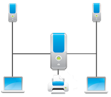 2. Show connections and relationships through proximity and connection lines.
3. Use "space" to enhance meaning
4. Use more visuals and fewer words. People are more interested in trends then numbers.
5. Avoid misinformation.
6. Use context to provide meaning.
7. Speak to the emotions to motivate, gain attention, and make content memorable: Makes people make decisions.
8. Ensure your graphics are cognitively compatible: don't want users to take time to figure out what the graphic means (cognitive dissonance)
9. Simplify for quick perception and interpretation: graphics are more easily understood when they are simple, less visual cues (e.g. line drawings)
10. Always consider desired outcome when conceiving and designing a graphic.
The eLearning Coach Web site:http://theelearningcoach.com/
Comments